

As part of our user-experience (UX) design process, Rocket researches the full user experience – including the environment and full information flow in support of user workflows. This includes operations centers, which often have wall-mounted displays for the entire room and/or floor managers and leaders to use. So what is necessary for designing UX for giant screens?
’10-foot user interface’ is the industry term for devices like Roku or Apple TV, specifically designed for comfortable viewing and interacting at couch distance. But control room displays are usually larger and farther away. This has prompted us to think about how to best design for these displays.
Examining Space Operations
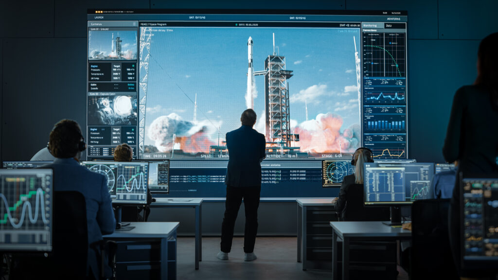
Rocket launches and satellite systems are usually managed from large rooms with operators facing giant screens at the front, just like in the movies.
Operations Center at NASA
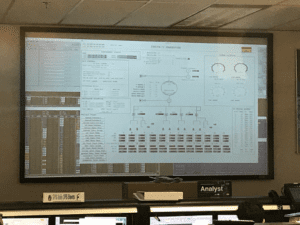
Rocket Communications specializes in app design for space operations, and we’ve visited many of these rooms. Unfortunately, these giant screens are almost always just a mirror of a workstation somewhere in the room. To make things worse, they show a cluttered desktop UI and are often unreadable from a distance.
With this use case in mind, we’ve studied the problem, prototyped some solutions, and learned a few things about designing UX for giant screens that are worth sharing.
Optimizing Astro Launches for Giant Screens
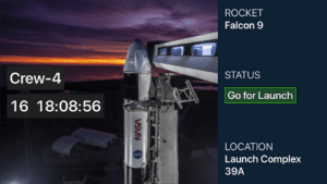
We developed Astro Launches for Apple TV, which displays interesting information about upcoming space launches. Launches is based upon our Astro Space UX Design System, which we’ve extended to all Apple platforms. Astro Launches, in 10-foot mode, uses the standard text and component sizes provided by Apple TV, perfectly suitable for a nearby screen, such as a TV in a living room or meeting room.
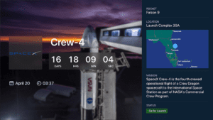
Astro Launches in 10-foot mode
But as we considered optimizing Launches for giant screen mode, it required many alterations. Below are a few of the changes we required, and some explanation around them, before showing the resulting Launches in giant-screen mode.
Human Vision and Size
Thanks to a foundation of human factors research, we know that to be legible, items must fit in an arc of 19 minutes (19/60th of a degree) from the most distant viewer.

We’ve developed calculations that, given the screen size and the distance to the viewer farthest away, find the minimum object size, in inches and points, which is how screen elements are specified.
For example, the minimum object size for an 85-inch screen at 25 feet, is 2 inches, or 43 points. Astro Launches in giant screen mode is scaled to fit this example.
Font Size
That 43-point minimum object size provides enough information to size an icon or image, but further calculations are required to determine a legible font size.
The smallest lowercase letter in the font must be legible, but font sizes include the height of capital letters and descenders below the baseline*. We must therefore apply a font-scaling factor to assure that the smallest letters are rendered at the minimum size.

Minimum font size scale
This factor can be calculated exactly if the font metrics are known, but a generic scaling factor of 1.4 can be substituted. Applying this to the 43-point size in our sample calculation, gives us a minimum font size of 60, much larger than 10-foot UI standards
Font Choice
Human factors research on readable big screen fonts generally recommends…
- A sans serif font
- Bold weight
- Tall x-Height (lower case letters are relatively tall)
Astro Launches uses Apple’s SF Pro Display, which has all of these qualities.
An interesting reference is the familiar Highway Gothic font, developed in the 1940s to standardize US road signs.
Contrast
Designing UX for giant screens can also include projectors, which are not as bright and have less contrast than modern TVs.
Astro Launches, when in giant screen mode, adds heavier font weights and darker backgrounds behind text to improve legibility on such screens.
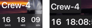
Giant screen design (right) with a denser text background and simplified display
Clutter
Using large fonts and images allows for less room for details on the screen. Proper 10-foot UIs are already uncluttered, but giant screen UIs require even more economy.
Launches removes the mission details, the map, and even the labels on the countdown clock when in giant screen mode, with only the most essential information remaining.
The Result: Launches in Giant Mode
Bringing all these considerations together, we optimized the Launches interface for better viewing on very large screens, at distances. As you can see, the result is a cleaner, easier to read interface.
For operations centers, more research is needed around data presentation. Many tend to use the giant screens more like dashboards or status indicators, but the principles are similar and would improve operations center information sharing and usability.
Astro Launches in giant screen mode